Refining a Raw Experience
CaveWhere Application UI
Project Overview
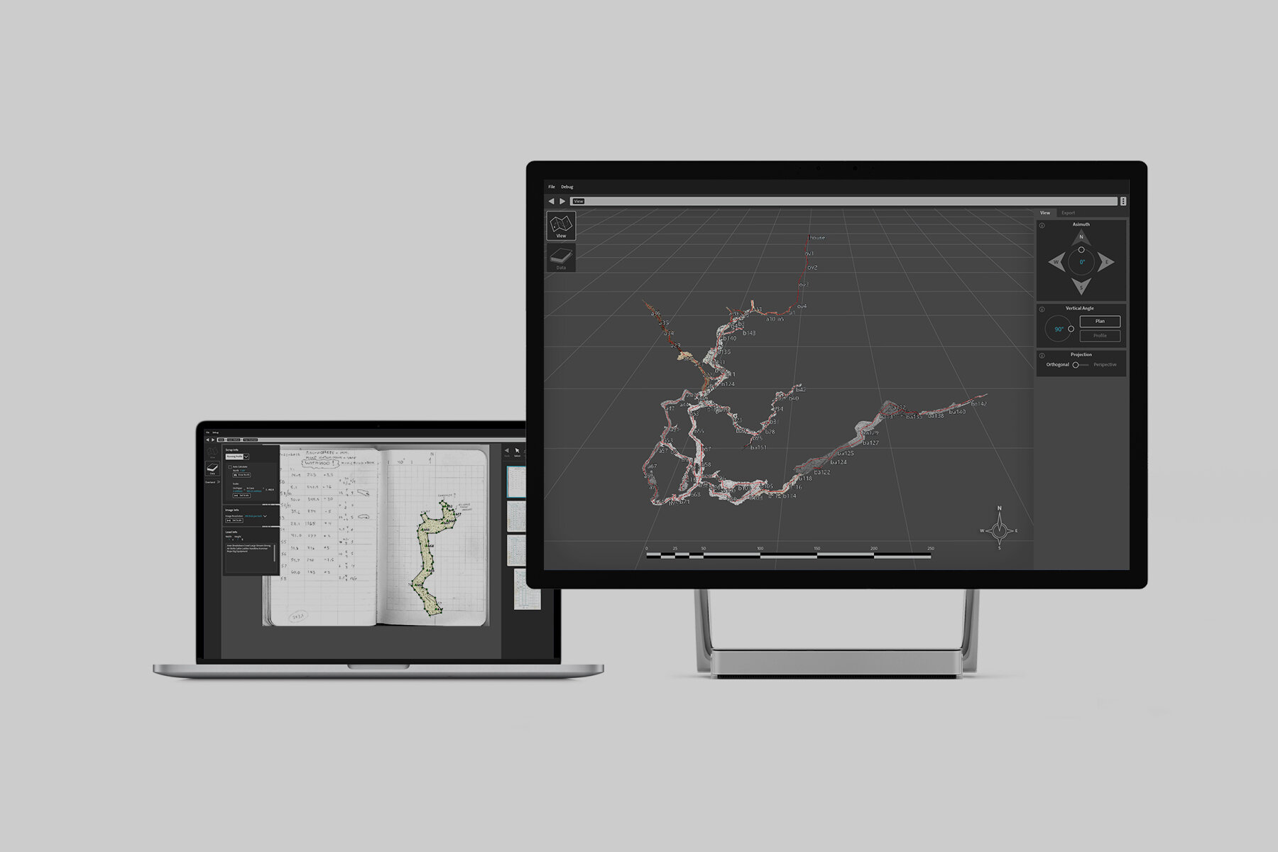
Working with the developer of an open-source cave-mapping application, CaveWhere, I was responsible for elevating the raw interface with refined aesthetic sensibilities, while improving user experience and usability.
Roles
UI/UX designer
Iconography
Animation Development
UI Comparison
While fully functional, the original CaveWhere interface lacked cohesion and a consistent experience.


Workflow Breakdown
The CaveWhere application consists of 2 main sections:
View
This is where users interact with a 3-Dimensional representation of mapped caves.
Data
The primary work environment of the application, this is where users catalog and input information from various cave expeditions.
View Section
In addition to providing a single compiled visualization of multiple surveys of the save cave system, the View section is also used to print to-scale maps for future expeditions.
The minimal dark environment draws focus on the interactive map.
The View and Export tabs alternate between map navigation and utilities for printing maps.
Tab Refinements
View Tab
- Dynamic GUI touchpoints are consistent (radial dial and toggles)
- Specific degrees can now be typed in or adjusted using the radial dial.
Export Tab
- Removed redundant scale icons.
- Removed extraneous “layer group” box.
Data Section
This section is segmented into 2 halves: the input area and the reference area.

Data
“Leads” Window Optimizations
In cave exploration, leads are points of entry to unexplored passageways or caverns.
Uncharted, it is important to know the qualities of the leads and if special equipment will be needed.
This method was redundant, cluttered, and took up a lot of visual space.
These were populated by adding preset descriptions, which were accessed via a pop-up window.
The Role of Color
Differentiation
Blue is used to identify editable text in areas where they may be confused as static text.
Attention
Color is also used as an accent and highlight, specifically in the note selection and application animations. It is also used to draw awareness to critical actions, like deletion.

Busy Indicator Animation
This thematic busy indicator is inspired by droplets of water that frequently drip from cave formations.


A Natural Influence
The client specified an overall dark visual theme for the application. This paved the way for specific color highlights that would serve as identifying elements.
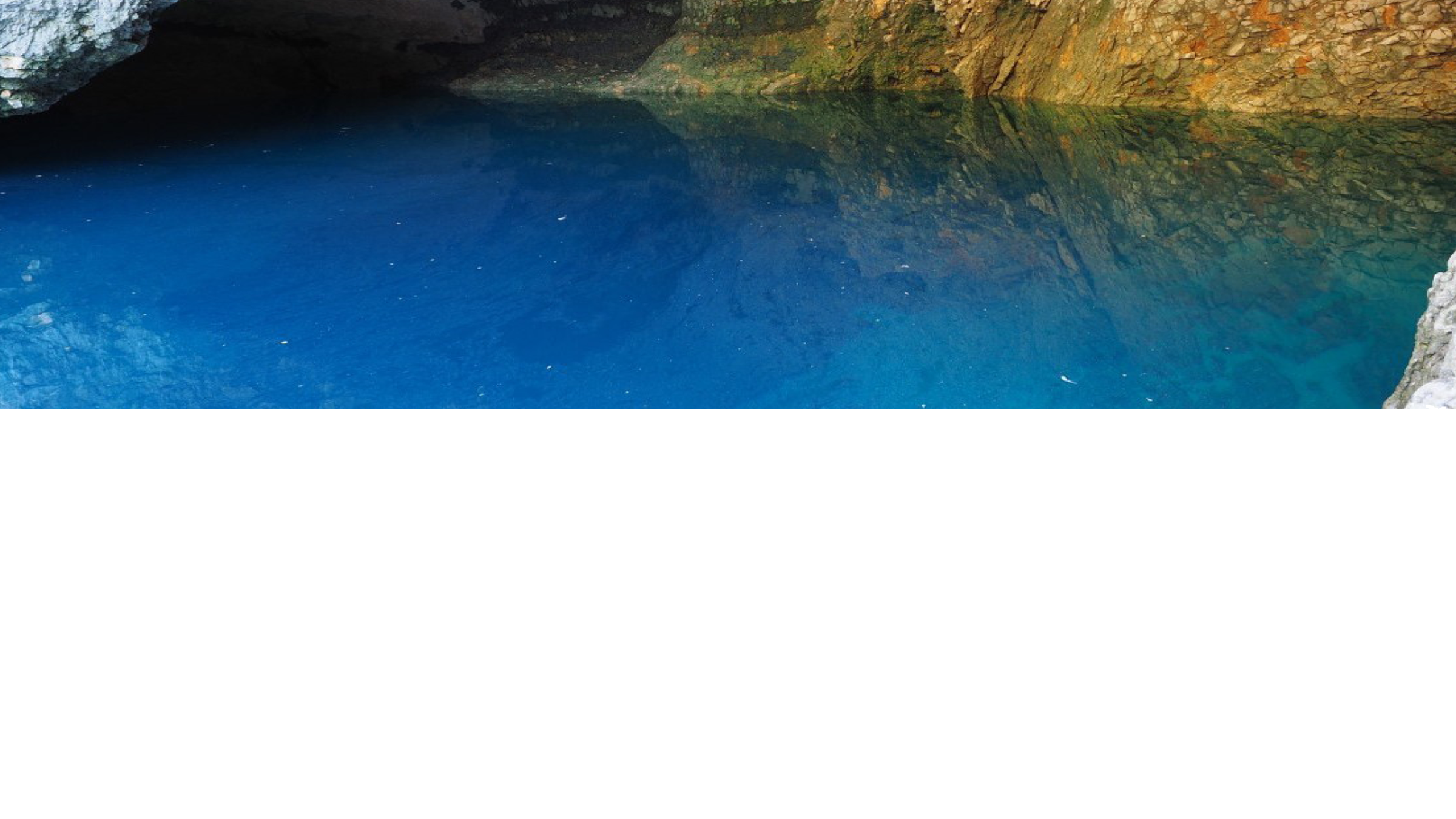
Conversations with the client brought up the idea of Karst springs, which can be found alongside many cave sites. They are bodies of water that are end-points for cavern drainage systems.
Reference Library
Using found images of karst springs, I distilled their color profiles into a reference library. This would form the basis for the color highlights.


