
A Visual Brand Extension
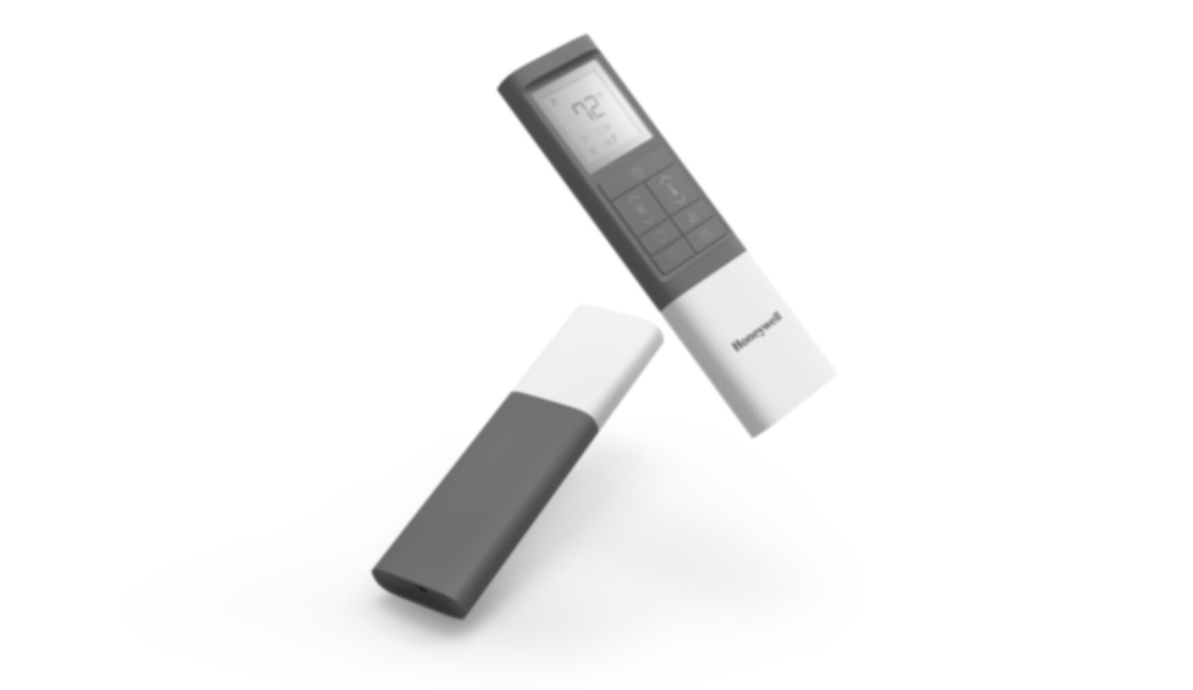
Honeywell Remote Control
Project Overview
Developed in tandem with a portable air conditioner, my team worked with Honeywell licensee, Jmatek, to develop a new remote control. The goal was to revamp the existing and outdated remote, while designing a platform that can be used across several price tiers.
Roles
project lead
industrial designer
UI designer
CAD modeler
renders
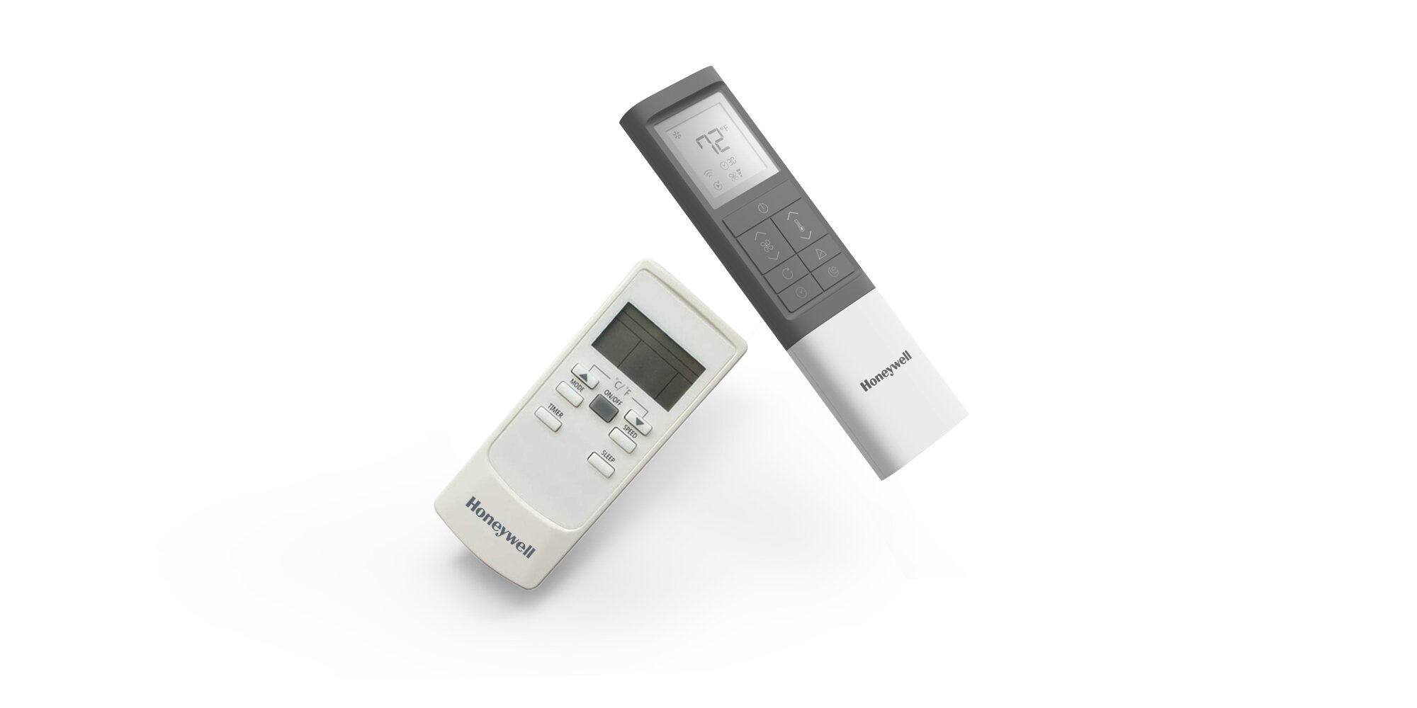
Breaking from the Past
The existing remote controls were horribly outdated, favored cheap manufacturing over any cohesive design language, and did not conform to Honeywell’s current Visual Brand Language.

Development
The remote’s layout was driven by the opening-price-point features, but with the understanding that new functions will be added as the remote becomes used for higher tiered products.

Iconography
The remote and air conditioner bundle would be sold in international markets, so it became crucial to use purely visual iconography. With a provided visual brand guideline set by Honeywell, I developed icons for both existing and new features.
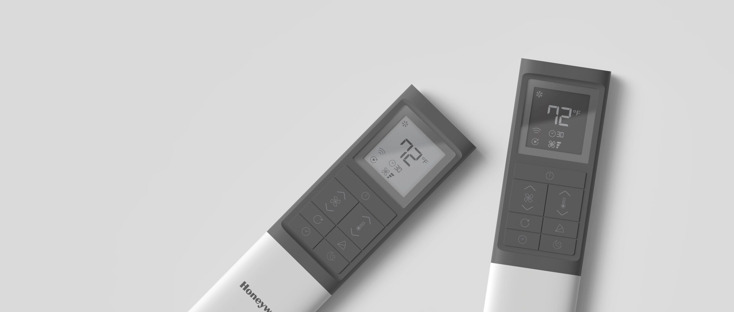
Same Icons, Different Tiers
Two screen versions were offered with the remote; one for a lower price point, and the other for a premium. Both maintained consistent iconography, but the premium tier was differentiated with an inverted LCD display, which reflected higher production costs.